Every focused view does two things at once. It gives you something by removing noise - and it takes something by removing it. Most tools only think about the giving. The good ones pay back what focusing cost you.
I ran into both halves of this while building a context view for Schemity, and the symmetry turned out to be the interesting part. Not the features. The principle underneath them.
The problem with looking at everything
Here is a slice of a multi-tenant auth schema in the main diagram view. SSO, authorization, and one-time passwords all sit on one canvas, wired together by foreign keys.
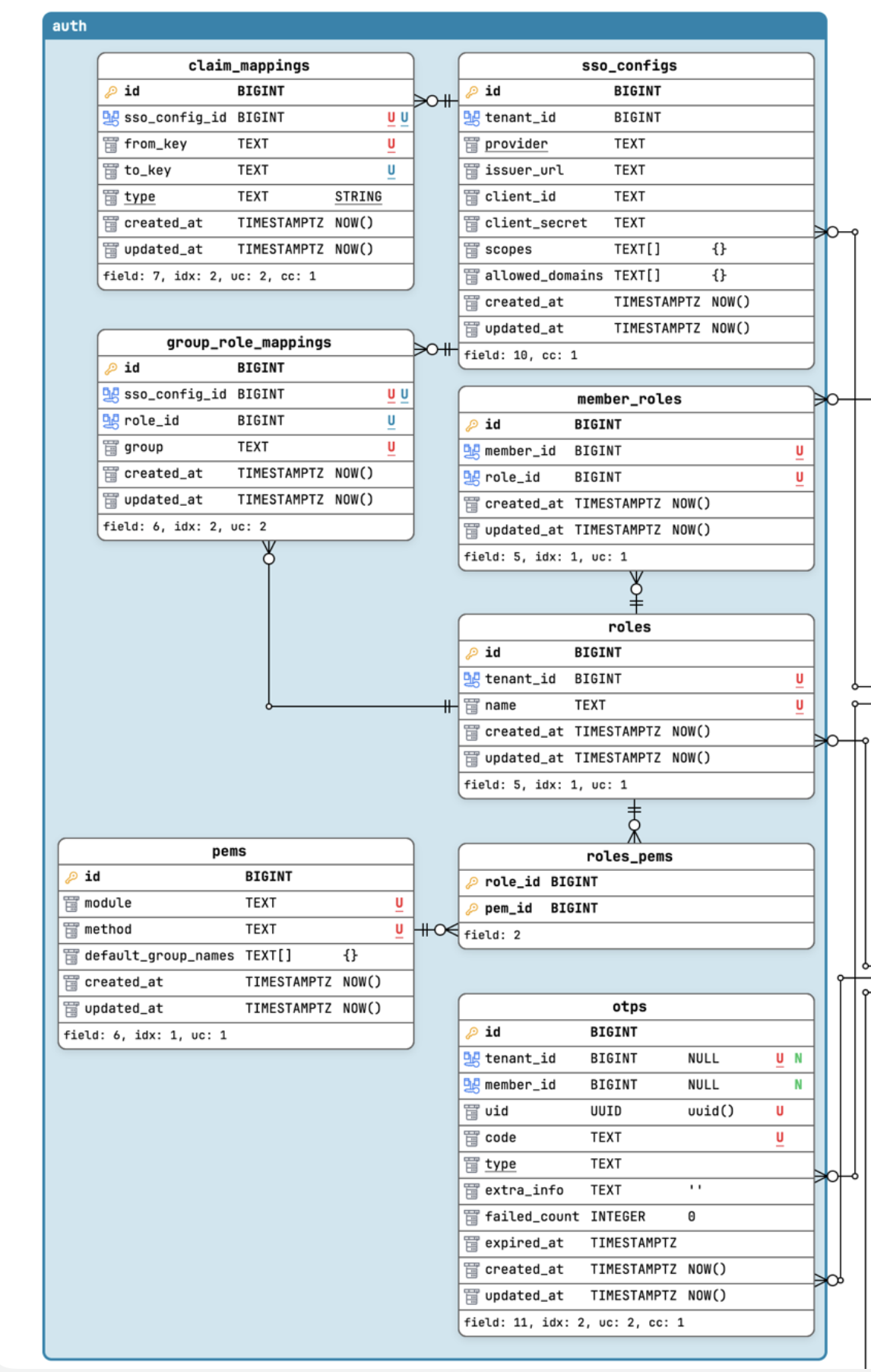
You can find the structure here if you look. SSO config on the left, the role/permission cluster in the middle, OTP off on its own. But you have to reconstruct that grouping in your head, because the crossing relationship lines compete for attention with the ones inside each cluster. The diagram knows the structure. It just doesn’t hand it to you.
So I added a context view: import only the entities for one concern, drop everything else, and lay them out by hand.
What focusing gives
The moment you pull a concern out and arrange it freely, the coherence surfaces on its own:
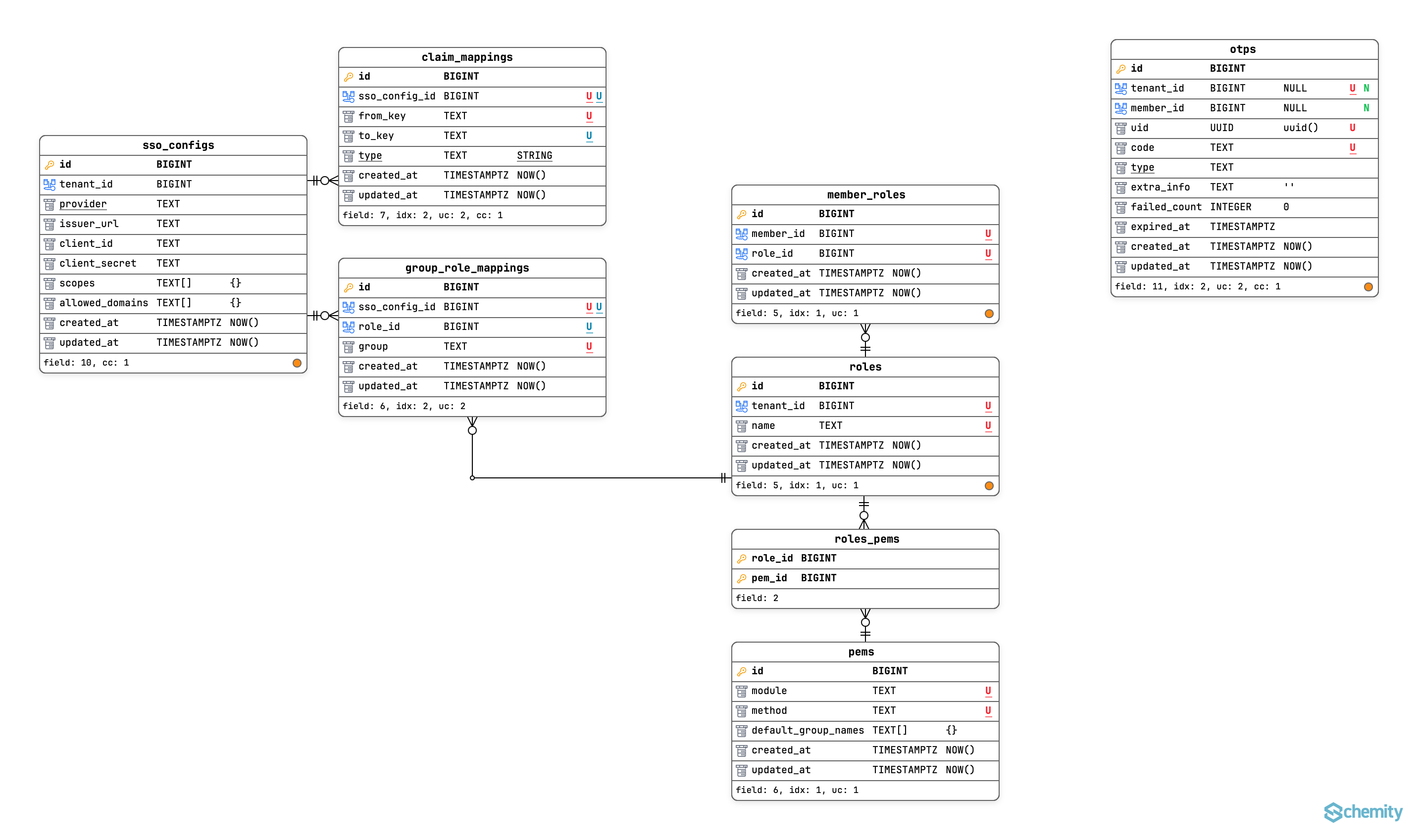
This is focus giving. With the unrelated entities gone and the global layout no longer fighting you, the natural clusters fall out - SSO config here, authorization there, OTP standing alone. You stop reasoning about the tool’s picture and start reasoning about your schema. That is the whole point of a focused view: it should disappear while you think.
If the story ended there, this would be an unremarkable feature. Filtered views are old news. The interesting thing is what focusing quietly broke.
What focusing takes
In the main view, “this entity reaches outside its cluster” is free information. You see the line leave. It’s encoded in the layout itself.
The instant I imported into a context view and re-arranged, that cue was gone - not hidden, destroyed. The act of focusing threw away the one signal that told me which entities were boundary entities. And those are exactly the ones that need care: an entity with no outside ties can move freely if I ever split this context out; an entity with outside ties carries a contract.
So inside the context view I was doing this, by hand, for every table: read its foreign keys, hold the context’s membership set in my head, check each key against the set. The work isn’t hard. It’s repetitive and interruptive. The membership set doesn’t fit in working memory, so I reloaded it per entity, and every reload evicted whatever I’d actually come to the view to think about. A tool that makes you stop reasoning about your schema in order to reason about the tool’s incomplete picture has become visible in the worst way.
The fix is almost embarrassingly small once you see it. Whether an entity is a boundary entity is a static fact - it doesn’t depend on my layout or my focus or what I’m currently doing. There is no reason that computation should live in my head when it can live on the canvas. So the view precomputes it and renders a small orange dot on the right side of the entity footer - the ones you see scattered across the screenshot above.
That’s it. One bit per entity, in one glance: this one reaches outside what you’re seeing.
Why one bit, and not more
The temptation is to make the orange dot analytic - encode which context it connects to, which direction the dependency runs, which column is the seam. Different colors per neighbor context, a number, a tooltip listing the foreign keys. I went down that road and backed out, because it’s the wrong tool for the wrong job.
Boundary analysis - seeing seams, which contexts couple to which, who depends on whom - is inherently a whole-graph question. You cannot analyze a boundary from inside one side of it. The main view, where the crossing edges actually exist, is the correct instrument for that. Asking the focused lens to also do the wide-angle job is how you end up rebuilding the wrong tool in the wrong place.
So in the context view the dot stays one bit. Its job is not analysis. Its job is honesty: the set you’re looking at is not closed, go to the main view to see what it touches. It restores the fact that focusing destroyed, and points back to where the real edges live. Nothing more.
The principle
A view that removes context owes you back the context it removed.
Both halves of this feature are the same idea wearing two faces. Free arrangement is focus giving, coherence you couldn’t see in the crowd. The boundary marker is focus paying back, a fact the crowd showed you for free and the focused view structurally cannot. Get only the first half and you’ve built a prettier filter. Get both and you’ve built a view that doesn’t lie about what it’s hiding.
This isn’t specific to schema diagrams. Code folding, filtered logs, map zoom levels, any dashboard that scopes to a subset, they all remove context to gain focus, and they all face the same question: what did focusing destroy, and can the tool give it back? Usually the answer is some small, static, derivable-but-tedious fact that’s now stranded in the user’s working memory. Moving it back onto the surface is rarely a big feature. It’s just closing a leak.
The test I’d apply to any focused view from now on: not “is this cleaner?” but “what fact did the user lose when they focused, and have I given it back to them?”